Introduction
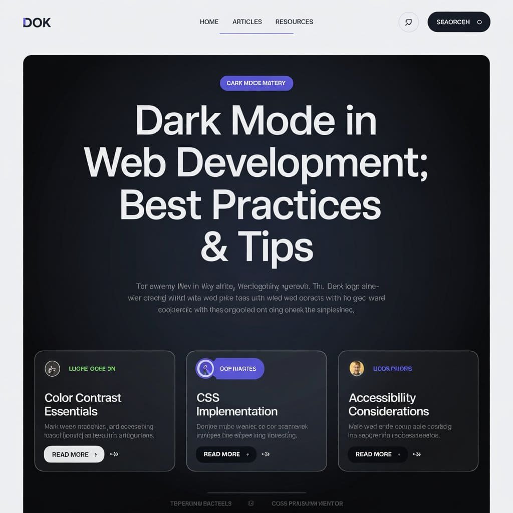
In modern web development, dark mode takes over the screen with its interface-anything format for reliever users from unnecessary eye strains, saving battery life on OLED screens, and looking good at the same time. To implement it properly into your interfaces, however, take proper planning and best practices; then this blog would discuss the principles, strategies, and technical approaches towards integrating dark mode into web applications.
Why Dark Mode Matters
Unlike just a fad, dark mode has usability and accessibility parts as well:
- Reduced Eye Strain: Especially in a dark ambiance, glare is kept to a minimum by dark mode.
- Power Saving: Dark colors on OLED displays require less energy to show.
- Defaulting: Many people like dark mode because it looks attractive, and is pleasant to use over extended periods.
Nevertheless, research shows that dark mode usually performs best during the night or in dark environments, and light mode functions best during day light.

Top-notch Implementation Techniques for Dark Mode
- Give Control to Users
Despite the fact that a number of devices apply a theme automatically according to the user’s system choices with the use of the prefers-color-scheme CSS media query, it should still have a manual toggle to be inclusive. Some users do not actually know these settings from the system, while others do not require an automatic change.
- CSS Variables
CSS variables centralize all the color definitions, making them very easy to manage. Such as defining:
					:root {
  --background-color: #ffffff;
  --text-color: #000000;
}

body.dark-mode {
  --background-color: #121212;
  --text-color: #ffffff;
}

body {
  background-color: var(--background-color);
  color: var(--text-color);
}
Now switching themes becomes as easy as toggling the. dark-mode class on the <body> element.
- Be Accessible
Provide a good contrast ratio between the background color and the text colors to meet the standards set by WCAG. Do not use pure black (#000000); all black is intense, use softer options such as #121212.
- Accumulating Preferences by User
Persist the user’s theme preference using local storage or cookies and maintain it over the sessions:
					const toggleTheme = () => {
  const currentTheme = localStorage.getItem('theme');
  const newTheme = currentTheme === 'dark' ? 'light' : 'dark';
  document.body.className = newTheme;
  localStorage.setItem('theme', newTheme);
};
This approach prevents a “flash” of improper theme settings during page loads.
- Design in Terms of Foreground/Background
Use slight variations in opacity instead of solid colors to create depth and hierarchy in the dark mode designs. This helps in improving readability and gives visual clarity.
Implementation Strategies
- CSS Media Query
The prefers-color-scheme media query is the simplest means of implementing dark mode:
					@media (prefers-color-scheme: dark) {
	body {
		background-color: #121212;
		color: #ffffff;
	}
}
@media (prefers-color-scheme: light) {
	body {
		background-color: #ffffff;
		color: #000000;
	}
}
This solution automatically applies in accordance with the user’s system settings but cannot give manual control.
- JavaScript Toggle
Manual toggle:
					document.querySelector('#theme-toggle').addEventListener('click', () => {
	document.body.classList.toggle('dark-mode');
});
Would work great with local storage to save a preference.
- Hybrid Solution
Combining prefers-color-scheme with a manual toggle will provide maximum flexibility:
- It stays with system preference by default.
- Users can override the system preference with a toggle button.
- That preference can be persisted through local storage or cookies.

Challenges and Solutions
- Flash of Wrong Theme
To prevent flashing between themes during page load:
And the stored theme is applied very early using inline JavaScript before the importing of external stylesheets.
Example:
  const theme = localStorage.getItem('theme') || 'light';
  document.documentElement.className = theme;
- Accessibility Concerns
Test both the light and dark modes for accessibility by checking contrast ratios and usability with tools such as Lighthouse or Axe.
- Consistent Design Across Pages
For multi-page websites, dynamically add stylesheets or shared CSS variables to ensure a consistent theme in your pages.
Conclusion
Dark mode is more than just an aesthetic choice; it can enhance usability, accessibility, and user satisfaction when implemented in a thoughtful manner. Combining CSS media queries with JavaScript toggles combined with best practices such as accessibility optimization, persistent preferences, and the like will give rise to a seamless and user-friendly dark mode experience.
Embracing such strategies would ensure that your web applications meet various people-individual needs while being ahead of modern design trends.
Table of Contents
Interesting Posts


Styling Text in CSS

How to Deploy a Website Using GitHub Pages

BSCS 8th Semester Notes

What Is an API? A Simple Guide for Beginners

Wireless Communication Handwritten Notes
Ghulam Ahmad is an Excellent Writer, His magical words added value in growth of our life. Highly Recommended
- Irfan Ahmad Tweet

Build a Full-Stack App with MERN Stack Pt 2


Build a Full-Stack App with MERN Stack Pt 1


2 Responses