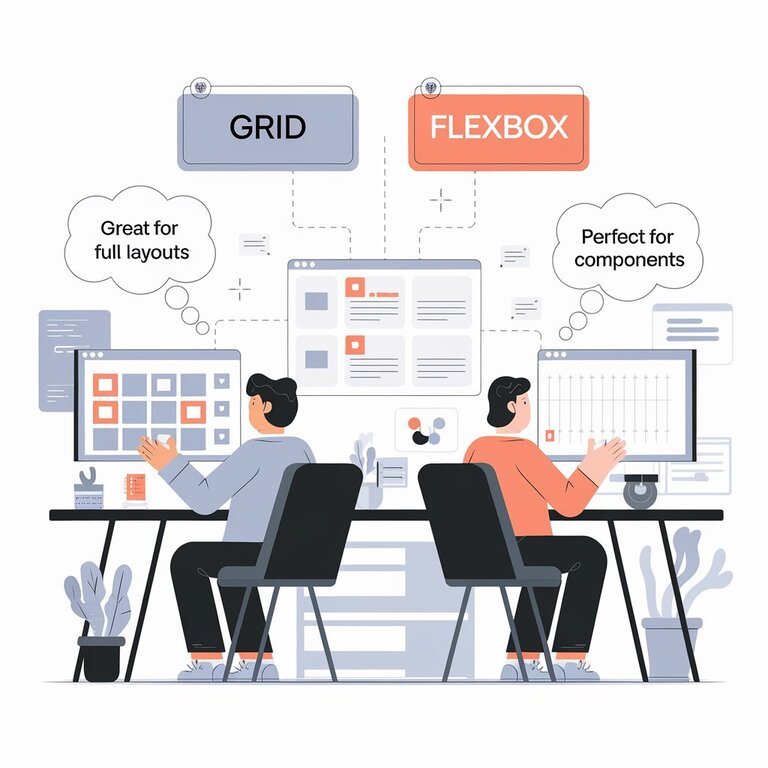
The fundamental distinction between CSS Grid and Flexbox lies in their dimensional capabilities and intended purposes. CSS Grid is a two-dimensional layout system that allows precise control over both rows and columns simultaneously, while Flexbox is a one-dimensional layout system that excels at arranging items along a single axis—either horizontally or vertically.
This dimensional difference makes CSS Grid ideal for complex, structured layouts where you need to control the positioning of elements in multiple directions, while Flexbox shines for component-level arrangements and content distribution along a single direction.
When to Use CSS Grid
Complex Layout Structures
CSS Grid excels when you need to create complex, two-dimensional layouts with precise control over positioning. It’s particularly well-suited for:
Full-page layouts with defined header, sidebar, main content, and footer areas.
Multi-dimensional grid systems where content needs to span multiple rows and columns.
Overlapping layouts where elements need to be layered or positioned precisely.
Image galleries with varying sizes and arrangements.
Layout-First Design Approach
CSS Grid follows a layout-driven approach where you define the structure first, then place content within it. This makes it ideal when you have a predetermined design structure and need elements to fit specific grid areas regardless of their content size.
Responsive Design Without Media Queries
CSS Grid can create responsive layouts with minimal media queries using features like
auto-fit, minmax(),
and fractional units. This allows for algorithmic responsiveness where the layout adapts automatically to different screen sizes.
Flexbox is perfect for single-axis layouts where you need to arrange items in a row or column. Common use cases include:
Navigation bars with evenly distributed menu items.
Button groups requiring consistent spacing and alignment
Card layouts where items need equal heights.
Form elements needing horizontal or vertical alignment.
Content-First Approach
Flexbox follows a content-driven approach where the layout adapts to the size and nature of the content. This makes it ideal when content size varies and you want the layout to respond dynamically.
Dynamic Alignment and Distribution
Flexbox provides powerful alignment capabilities with properties like
CSS Grid generally performs better for complex layouts due to its two-dimensional nature, which reduces the need for nested containers. For simple layouts, Flexbox typically renders faster due to its lighter computational requirements.
Browser Performance Comparison
Modern browsers handle both CSS Grid and Flexbox efficiently, with Chrome consistently outperforming other browsers in rendering both systems. However, the performance difference becomes more noticeable with complex layouts containing many elements.
Memory Usage
Flexbox generally uses less memory for simple, one-dimensional layouts, while CSS Grid may consume more memory due to its two-dimensional calculations. For optimal performance, use the appropriate tool for each specific layout requirement.
Browser Support and Limitations
CSS Grid Limitations
Limited browser support in older versions, particularly Internet Explorer which only supports an outdated specification
Complex syntax that can be overwhelming for beginners
Potential for overuse in situations where simpler solutions would suffice
Flexbox Limitations
Content shifting during loading can cause layout instability, especially on slower connections
Limited two-dimensional control compared to CSS Grid
Complex behavior with properties like flex-basis, flex-wrap, and the flex shorthand
Combining CSS Grid and Flexbox
The most effective approach often involves using both systems together, leveraging their respective strengths:
CSS Grid for overall page structure and complex layout areas
Flexbox for component-level alignment and content distribution within grid areas
This hybrid approach maximizes the benefits of both systems while minimizing their individual limitations.
Decision Framework
When choosing between CSS Grid and Flexbox, consider these key questions\:
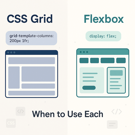
How many dimensions do you need to control? Use Grid for two-dimensional layouts, Flexbox for one-dimensional arrangements
Is your design layout-first or content-first? Grid works better for predetermined structures, Flexbox for content-driven layouts
How complex is your layout? Grid excels with complexity, Flexbox shines with simplicity
Do you need precise positioning control? Grid provides better control over exact placement
Are you working with components or page structure? Flexbox for components, Grid for overall layout architecture
Best Practices
Start with the content and layout requirements before choosing a system
Use feature queries (@supports) to provide fallbacks for older browsers
Combine both systems strategically rather than treating them as mutually exclusive
Test performance with realistic content amounts and slower connections
Follow semantic HTML practices and maintain accessibility standards regardless of layout choice
By understanding these fundamental differences and use cases, you can make informed decisions about when to use CSS Grid versus Flexbox, creating more effective and maintainable web layouts that serve both your design goals and user experience requirements.


3 Responses
Nice man very interesting post very knowledgeable I like it