

Artist Portfolio HTML CSS Project

Basic Project Setup
- Collect images links and font (click) link
Writing the Navbar Markup
Header:
- The header is the head of the webpage. All the element like navbar, logo is in navbar.
					<header>

</header>
Navbar:
- It is a section that provides navigation links, either within the current document or other documents.
					<nav>
    <ol>
    	<li> Home </li>
	<ol>
</nav>
					/* HTML Code Ahmadwebx*/
<!DOCTYPE html>
<html lang="en">

<head>
    <meta charset="UTF-8">
    <meta http-equiv="X-UA-Compatible" content="IE=edge">
    <meta name="viewport" content="width=device-width, initial-scale=1.0">
    <link rel="preconnect" href="https://fonts.googleapis.com">
    <link rel="preconnect" href="https://fonts.gstatic.com" crossorigin>

    <link rel="stylesheet" href="index.css">
    <title>JSCermics</title>
</head>

<body>
    <header>
        <h1>Joseph Shmoe | Ceramics</h1>
        <nav>
            <ul>
                <li><a href="#work">Work</a></li>
                <li><a href="#about">About</a></li>
                <li><a href="#contact">Contact</a></li>
            </ul>
        </nav>
    </header>

</body>

</html>
					/* CSS Code */
body {
  font-family: Cormorant, serif;
}
Styling the Navbar
- We use all the header content use inline-block as display.
- That makes all the content is inline. Then we change color, margin, etc. to change the design.
Display: inline-block;
					/*CSS Code*/
h1 {
  display: inline-block;
}

.links {
  display: inline-block;
}

.links li {
  display: inline-block;
}

.links a {
  color: black;
  text-decoration: none;
  font-size: 20px;
  margin: 0 8px;
}
Finishing Up the Navbar
- Changing in padding, margin and add border.
					/*CSS Code*/
.links ul {
  padding: 0;
}
.navbar {
  margin: 32px;
}

a.active {
  border-bottom: 1px solid black;
}
Creating the Photo Grid
Add image links at once press and hold alt button and select all the point where the image link is start,
<img class="lazy lazy-hidden" src= “link” ><noscript><img src= “link” ></noscript>.
write Now image is added, but large in size. Give the
width: 40%;
which brings two images in row. We give the
height: 500px;
that makes equal size of all the images.
					 /* HTML Code Ahmadwebx*/
  <div class="card">
        <img class="lazy lazy-hidden" decoding="async"
            src="//ahmadwebx.com/wp-content/plugins/a3-lazy-load/assets/images/lazy_placeholder.gif" data-lazy-type="image" data-src="https://images.unsplash.com/photo-1565193566173-7a0ee3dbe261?ixlib=rb-4.0.3&ixid=MnwxMjA3fDB8MHxwaG90by1wYWdlfHx8fGVufDB8fHx8&auto=format&fit=crop&w=2670&q=80"><noscript><img decoding="async"
            src="https://images.unsplash.com/photo-1565193566173-7a0ee3dbe261?ixlib=rb-4.0.3&ixid=MnwxMjA3fDB8MHxwaG90by1wYWdlfHx8fGVufDB8fHx8&auto=format&fit=crop&w=2670&q=80"></noscript>
        <h2>Joshua Vase</h2>
    </div>
    <div class="card">
        <img class="lazy lazy-hidden" decoding="async"
            src="//ahmadwebx.com/wp-content/plugins/a3-lazy-load/assets/images/lazy_placeholder.gif" data-lazy-type="image" data-src="https://images.unsplash.com/photo-1578749556568-bc2c40e68b61?ixlib=rb-4.0.3&ixid=MnwxMjA3fDB8MHxwaG90by1wYWdlfHx8fGVufDB8fHx8&auto=format&fit=crop&w=2670&q=80"><noscript><img decoding="async"
            src="https://images.unsplash.com/photo-1578749556568-bc2c40e68b61?ixlib=rb-4.0.3&ixid=MnwxMjA3fDB8MHxwaG90by1wYWdlfHx8fGVufDB8fHx8&auto=format&fit=crop&w=2670&q=80"></noscript>
        <h2>Larkin Plates</h2>
    </div>
    <div class="card">
        <img class="lazy lazy-hidden" decoding="async"
            src="//ahmadwebx.com/wp-content/plugins/a3-lazy-load/assets/images/lazy_placeholder.gif" data-lazy-type="image" data-src="https://images.unsplash.com/photo-1610701596007-11502861dcfa?ixlib=rb-4.0.3&ixid=MnwxMjA3fDB8MHxwaG90by1wYWdlfHx8fGVufDB8fHx8&auto=format&fit=crop&w=1740&q=80"><noscript><img decoding="async"
            src="https://images.unsplash.com/photo-1610701596007-11502861dcfa?ixlib=rb-4.0.3&ixid=MnwxMjA3fDB8MHxwaG90by1wYWdlfHx8fGVufDB8fHx8&auto=format&fit=crop&w=1740&q=80"></noscript>
        <h2>Fortessa Cloud No 2</h2>
    </div>
    <div class="card">
        <img class="lazy lazy-hidden" decoding="async"
            src="//ahmadwebx.com/wp-content/plugins/a3-lazy-load/assets/images/lazy_placeholder.gif" data-lazy-type="image" data-src="https://images.unsplash.com/photo-1576020799627-aeac74d58064?ixlib=rb-4.0.3&ixid=MnwxMjA3fDB8MHxwaG90by1wYWdlfHx8fGVufDB8fHx8&auto=format&fit=crop&w=2615&q=80"><noscript><img decoding="async"
            src="https://images.unsplash.com/photo-1576020799627-aeac74d58064?ixlib=rb-4.0.3&ixid=MnwxMjA3fDB8MHxwaG90by1wYWdlfHx8fGVufDB8fHx8&auto=format&fit=crop&w=2615&q=80"></noscript>
        <h2>Astoria Collection</h2>
    </div>
    <div class="card">
        <img class="lazy lazy-hidden" decoding="async"
            src="//ahmadwebx.com/wp-content/plugins/a3-lazy-load/assets/images/lazy_placeholder.gif" data-lazy-type="image" data-src="https://images.unsplash.com/photo-1525974160448-038dacadcc71?ixlib=rb-4.0.3&ixid=MnwxMjA3fDB8MHxwaG90by1wYWdlfHx8fGVufDB8fHx8&auto=format&fit=crop&w=2274&q=80"><noscript><img decoding="async"
            src="https://images.unsplash.com/photo-1525974160448-038dacadcc71?ixlib=rb-4.0.3&ixid=MnwxMjA3fDB8MHxwaG90by1wYWdlfHx8fGVufDB8fHx8&auto=format&fit=crop&w=2274&q=80"></noscript>
        <h2>Lava Beach Stoneware</h2>
    </div>
    <div class="card">
        <img class="lazy lazy-hidden" decoding="async"
            src="//ahmadwebx.com/wp-content/plugins/a3-lazy-load/assets/images/lazy_placeholder.gif" data-lazy-type="image" data-src="https://images.unsplash.com/photo-1610701596061-2ecf227e85b2?ixlib=rb-4.0.3&ixid=MnwxMjA3fDB8MHxwaG90by1wYWdlfHx8fGVufDB8fHx8&auto=format&fit=crop&w=2670&q=80"><noscript><img decoding="async"
            src="https://images.unsplash.com/photo-1610701596061-2ecf227e85b2?ixlib=rb-4.0.3&ixid=MnwxMjA3fDB8MHxwaG90by1wYWdlfHx8fGVufDB8fHx8&auto=format&fit=crop&w=2670&q=80"></noscript>
        <h2>Sand Canyon Bowls</h2>
    </div>
    <div class="card">
        <img class="lazy lazy-hidden" decoding="async"
            src="//ahmadwebx.com/wp-content/plugins/a3-lazy-load/assets/images/lazy_placeholder.gif" data-lazy-type="image" data-src="https://images.unsplash.com/photo-1490312278390-ab64016e0aa9?ixlib=rb-4.0.3&ixid=MnwxMjA3fDB8MHxwaG90by1wYWdlfHx8fGVufDB8fHx8&auto=format&fit=crop&w=2670&q=80"><noscript><img decoding="async"
            src="https://images.unsplash.com/photo-1490312278390-ab64016e0aa9?ixlib=rb-4.0.3&ixid=MnwxMjA3fDB8MHxwaG90by1wYWdlfHx8fGVufDB8fHx8&auto=format&fit=crop&w=2670&q=80"></noscript>
        <h2>Lennon Collection</h2>
    </div>
    <div class="card">
        <img class="lazy lazy-hidden" decoding="async"
            src="//ahmadwebx.com/wp-content/plugins/a3-lazy-load/assets/images/lazy_placeholder.gif" data-lazy-type="image" data-src="https://images.unsplash.com/photo-1605883705077-8d3d3cebe78c?ixlib=rb-4.0.3&ixid=MnwxMjA3fDB8MHxwaG90by1wYWdlfHx8fGVufDB8fHx8&auto=format&fit=crop&w=2670&q=80"><noscript><img decoding="async"
            src="https://images.unsplash.com/photo-1605883705077-8d3d3cebe78c?ixlib=rb-4.0.3&ixid=MnwxMjA3fDB8MHxwaG90by1wYWdlfHx8fGVufDB8fHx8&auto=format&fit=crop&w=2670&q=80"></noscript>
        <h2>Mendocino Dinnerware</h2>
    </div>
					/*CSS Code*/
.card {
  width: 49.75%;
  display: inline-block;
  box-sizing: border-box;
  padding: 16px;
}

.card img {
  height: 500px;
  width: 100%;
}

.card h2 {
  display: inline-block;
}
Continuing the Photo Grid
If we add h2 under every image the image is now one in a row. So why it does happen? Because there is space btw every other element. So, we add
					<div>

</div>
element in every image and h2’s. and change
display: inline-block
to div. Now change
width: 100%;
for image. Now, change the 40% width into
width: 49.75%
or approach to 50%. Because there is a space between two div. Now we use
box-sizing: border-box;
so, we use padding now instead of margin because padding is use inside the element.
					/* HTML Code Ahmadwebx*/
    <section class="gallery">
        <div class="card">
            <img class="lazy lazy-hidden" decoding="async"
                src="//ahmadwebx.com/wp-content/plugins/a3-lazy-load/assets/images/lazy_placeholder.gif" data-lazy-type="image" data-src="https://images.unsplash.com/photo-1565193566173-7a0ee3dbe261?ixlib=rb-4.0.3&ixid=MnwxMjA3fDB8MHxwaG90by1wYWdlfHx8fGVufDB8fHx8&auto=format&fit=crop&w=2670&q=80"><noscript><img decoding="async"
                src="https://images.unsplash.com/photo-1565193566173-7a0ee3dbe261?ixlib=rb-4.0.3&ixid=MnwxMjA3fDB8MHxwaG90by1wYWdlfHx8fGVufDB8fHx8&auto=format&fit=crop&w=2670&q=80"></noscript>
            <h2>Joshua Vase</h2>
        </div>
        <div class="card">
            <img class="lazy lazy-hidden" decoding="async"
                src="//ahmadwebx.com/wp-content/plugins/a3-lazy-load/assets/images/lazy_placeholder.gif" data-lazy-type="image" data-src="https://images.unsplash.com/photo-1578749556568-bc2c40e68b61?ixlib=rb-4.0.3&ixid=MnwxMjA3fDB8MHxwaG90by1wYWdlfHx8fGVufDB8fHx8&auto=format&fit=crop&w=2670&q=80"><noscript><img decoding="async"
                src="https://images.unsplash.com/photo-1578749556568-bc2c40e68b61?ixlib=rb-4.0.3&ixid=MnwxMjA3fDB8MHxwaG90by1wYWdlfHx8fGVufDB8fHx8&auto=format&fit=crop&w=2670&q=80"></noscript>
            <h2>Larkin Plates</h2>
        </div>
        <div class="card">
            <img class="lazy lazy-hidden" decoding="async"
                src="//ahmadwebx.com/wp-content/plugins/a3-lazy-load/assets/images/lazy_placeholder.gif" data-lazy-type="image" data-src="https://images.unsplash.com/photo-1610701596007-11502861dcfa?ixlib=rb-4.0.3&ixid=MnwxMjA3fDB8MHxwaG90by1wYWdlfHx8fGVufDB8fHx8&auto=format&fit=crop&w=1740&q=80"><noscript><img decoding="async"
                src="https://images.unsplash.com/photo-1610701596007-11502861dcfa?ixlib=rb-4.0.3&ixid=MnwxMjA3fDB8MHxwaG90by1wYWdlfHx8fGVufDB8fHx8&auto=format&fit=crop&w=1740&q=80"></noscript>
            <h2>Fortessa Cloud No 2</h2>
        </div>
        <div class="card">
            <img class="lazy lazy-hidden" decoding="async"
                src="//ahmadwebx.com/wp-content/plugins/a3-lazy-load/assets/images/lazy_placeholder.gif" data-lazy-type="image" data-src="https://images.unsplash.com/photo-1576020799627-aeac74d58064?ixlib=rb-4.0.3&ixid=MnwxMjA3fDB8MHxwaG90by1wYWdlfHx8fGVufDB8fHx8&auto=format&fit=crop&w=2615&q=80"><noscript><img decoding="async"
                src="https://images.unsplash.com/photo-1576020799627-aeac74d58064?ixlib=rb-4.0.3&ixid=MnwxMjA3fDB8MHxwaG90by1wYWdlfHx8fGVufDB8fHx8&auto=format&fit=crop&w=2615&q=80"></noscript>
            <h2>Astoria Collection</h2>
        </div>
        <div class="card">
            <img class="lazy lazy-hidden" decoding="async"
                src="//ahmadwebx.com/wp-content/plugins/a3-lazy-load/assets/images/lazy_placeholder.gif" data-lazy-type="image" data-src="https://images.unsplash.com/photo-1525974160448-038dacadcc71?ixlib=rb-4.0.3&ixid=MnwxMjA3fDB8MHxwaG90by1wYWdlfHx8fGVufDB8fHx8&auto=format&fit=crop&w=2274&q=80"><noscript><img decoding="async"
                src="https://images.unsplash.com/photo-1525974160448-038dacadcc71?ixlib=rb-4.0.3&ixid=MnwxMjA3fDB8MHxwaG90by1wYWdlfHx8fGVufDB8fHx8&auto=format&fit=crop&w=2274&q=80"></noscript>
            <h2>Lava Beach Stoneware</h2>
        </div>
        <div class="card">
            <img class="lazy lazy-hidden" decoding="async"
                src="//ahmadwebx.com/wp-content/plugins/a3-lazy-load/assets/images/lazy_placeholder.gif" data-lazy-type="image" data-src="https://images.unsplash.com/photo-1610701596061-2ecf227e85b2?ixlib=rb-4.0.3&ixid=MnwxMjA3fDB8MHxwaG90by1wYWdlfHx8fGVufDB8fHx8&auto=format&fit=crop&w=2670&q=80"><noscript><img decoding="async"
                src="https://images.unsplash.com/photo-1610701596061-2ecf227e85b2?ixlib=rb-4.0.3&ixid=MnwxMjA3fDB8MHxwaG90by1wYWdlfHx8fGVufDB8fHx8&auto=format&fit=crop&w=2670&q=80"></noscript>
            <h2>Sand Canyon Bowls</h2>
        </div>
        <div class="card">
            <img class="lazy lazy-hidden" decoding="async"
                src="//ahmadwebx.com/wp-content/plugins/a3-lazy-load/assets/images/lazy_placeholder.gif" data-lazy-type="image" data-src="https://images.unsplash.com/photo-1490312278390-ab64016e0aa9?ixlib=rb-4.0.3&ixid=MnwxMjA3fDB8MHxwaG90by1wYWdlfHx8fGVufDB8fHx8&auto=format&fit=crop&w=2670&q=80"><noscript><img decoding="async"
                src="https://images.unsplash.com/photo-1490312278390-ab64016e0aa9?ixlib=rb-4.0.3&ixid=MnwxMjA3fDB8MHxwaG90by1wYWdlfHx8fGVufDB8fHx8&auto=format&fit=crop&w=2670&q=80"></noscript>
            <h2>Lennon Collection</h2>
        </div>
        <div class="card">
            <img class="lazy lazy-hidden" decoding="async"
                src="//ahmadwebx.com/wp-content/plugins/a3-lazy-load/assets/images/lazy_placeholder.gif" data-lazy-type="image" data-src="https://images.unsplash.com/photo-1605883705077-8d3d3cebe78c?ixlib=rb-4.0.3&ixid=MnwxMjA3fDB8MHxwaG90by1wYWdlfHx8fGVufDB8fHx8&auto=format&fit=crop&w=2670&q=80"><noscript><img decoding="async"
                src="https://images.unsplash.com/photo-1605883705077-8d3d3cebe78c?ixlib=rb-4.0.3&ixid=MnwxMjA3fDB8MHxwaG90by1wYWdlfHx8fGVufDB8fHx8&auto=format&fit=crop&w=2670&q=80"></noscript>
            <h2>Mendocino Dinnerware</h2>
        </div>
    </section>
					/* CSS Code*/
.gallery {
  padding: 16px;
}
.card {
  width: 49.75%;
  display: inline-block;
  box-sizing: border-box;
  padding: 16px;
}

.card img {
  height: 500px;
  width: 100%;
  object-fit: cover;
}

.card h2 {
  display: inline-block;
  margin: 8px 0 16px 0;
  font-weight: 300;
}
Adding the Footer Content
Add footer content as separate section.
					/* HTML Code Ahmadwebx*/
 <section class="about">
        <h3>Designing, making, and selling goods of timeless design and uncompromising
            integrity—made thoughtfully, honestly, and with pride—to be enjoyed with similar intention.</h3>
        <h3 class="cta">Let's work together.</h3>
        <div class="contact">
            <p>joseph@jsceramics.com</p>
            <p>(212)772-5445</p>
        </div>
    </section>
					/* CSS Code*/
.about {
  width: 40%;
  min-width: 600px;
  margin: 100px 0 100px 200px;
}

.about h3 {
  font-size: 40px;
  font-weight: 300;
}
.contact {
  margin-top: 100px;
}

.contact p {
  margin: 0;
  font-size: 20px;
}

.cta {
  border-bottom: 1px solid black;
  display: inline-block;
  padding-bottom: 8px;
  margin-top: 0;
}
Final Project
					/* HTML Code Ahmadwebx*/
<!DOCTYPE html>
<html lang="en">
<head>
    <meta charset="UTF-8">
    <meta http-equiv="X-UA-Compatible" content="IE=edge">
    <meta name="viewport" content="width=device-width, initial-scale=1.0">
    <link rel="preconnect" href="https://fonts.googleapis.com">
    <link rel="preconnect" href="https://fonts.gstatic.com" crossorigin>

    <link rel="stylesheet" href="index.css">
    <title>JSCermics</title>
</head>
<body>
    <header class="navbar">
        <h1>Joseph Shmoe | Ceramics</h1>
        <nav class="links">
            <ul>
                <li><a class="active" href="#work">Work</a></li>
                <li><a href="#about">About</a></li>
                <li><a href="#contact">Contact</a></li>
            </ul>
        </nav>
    </header>
    <section class="gallery">
        <div class="card">
            <img class="lazy lazy-hidden" decoding="async"
                src="//ahmadwebx.com/wp-content/plugins/a3-lazy-load/assets/images/lazy_placeholder.gif" data-lazy-type="image" data-src="https://images.unsplash.com/photo-1565193566173-7a0ee3dbe261?ixlib=rb-4.0.3&ixid=MnwxMjA3fDB8MHxwaG90by1wYWdlfHx8fGVufDB8fHx8&auto=format&fit=crop&w=2670&q=80"><noscript><img decoding="async"
                src="https://images.unsplash.com/photo-1565193566173-7a0ee3dbe261?ixlib=rb-4.0.3&ixid=MnwxMjA3fDB8MHxwaG90by1wYWdlfHx8fGVufDB8fHx8&auto=format&fit=crop&w=2670&q=80"></noscript>
            <h2>Joshua Vase</h2>
        </div>
        <div class="card">
            <img class="lazy lazy-hidden" decoding="async"
                src="//ahmadwebx.com/wp-content/plugins/a3-lazy-load/assets/images/lazy_placeholder.gif" data-lazy-type="image" data-src="https://images.unsplash.com/photo-1578749556568-bc2c40e68b61?ixlib=rb-4.0.3&ixid=MnwxMjA3fDB8MHxwaG90by1wYWdlfHx8fGVufDB8fHx8&auto=format&fit=crop&w=2670&q=80"><noscript><img decoding="async"
                src="https://images.unsplash.com/photo-1578749556568-bc2c40e68b61?ixlib=rb-4.0.3&ixid=MnwxMjA3fDB8MHxwaG90by1wYWdlfHx8fGVufDB8fHx8&auto=format&fit=crop&w=2670&q=80"></noscript>
            <h2>Larkin Plates</h2>
        </div>
        <div class="card">
            <img class="lazy lazy-hidden" decoding="async"
                src="//ahmadwebx.com/wp-content/plugins/a3-lazy-load/assets/images/lazy_placeholder.gif" data-lazy-type="image" data-src="https://images.unsplash.com/photo-1610701596007-11502861dcfa?ixlib=rb-4.0.3&ixid=MnwxMjA3fDB8MHxwaG90by1wYWdlfHx8fGVufDB8fHx8&auto=format&fit=crop&w=1740&q=80"><noscript><img decoding="async"
                src="https://images.unsplash.com/photo-1610701596007-11502861dcfa?ixlib=rb-4.0.3&ixid=MnwxMjA3fDB8MHxwaG90by1wYWdlfHx8fGVufDB8fHx8&auto=format&fit=crop&w=1740&q=80"></noscript>
            <h2>Fortessa Cloud No 2</h2>
        </div>
        <div class="card">
            <img class="lazy lazy-hidden" decoding="async"
                src="//ahmadwebx.com/wp-content/plugins/a3-lazy-load/assets/images/lazy_placeholder.gif" data-lazy-type="image" data-src="https://images.unsplash.com/photo-1576020799627-aeac74d58064?ixlib=rb-4.0.3&ixid=MnwxMjA3fDB8MHxwaG90by1wYWdlfHx8fGVufDB8fHx8&auto=format&fit=crop&w=2615&q=80"><noscript><img decoding="async"
                src="https://images.unsplash.com/photo-1576020799627-aeac74d58064?ixlib=rb-4.0.3&ixid=MnwxMjA3fDB8MHxwaG90by1wYWdlfHx8fGVufDB8fHx8&auto=format&fit=crop&w=2615&q=80"></noscript>
            <h2>Astoria Collection</h2>
        </div>
        <div class="card">
            <img class="lazy lazy-hidden" decoding="async"
                src="//ahmadwebx.com/wp-content/plugins/a3-lazy-load/assets/images/lazy_placeholder.gif" data-lazy-type="image" data-src="https://images.unsplash.com/photo-1525974160448-038dacadcc71?ixlib=rb-4.0.3&ixid=MnwxMjA3fDB8MHxwaG90by1wYWdlfHx8fGVufDB8fHx8&auto=format&fit=crop&w=2274&q=80"><noscript><img decoding="async"
                src="https://images.unsplash.com/photo-1525974160448-038dacadcc71?ixlib=rb-4.0.3&ixid=MnwxMjA3fDB8MHxwaG90by1wYWdlfHx8fGVufDB8fHx8&auto=format&fit=crop&w=2274&q=80"></noscript>
            <h2>Lava Beach Stoneware</h2>
        </div>
        <div class="card">
            <img class="lazy lazy-hidden" decoding="async"
                src="//ahmadwebx.com/wp-content/plugins/a3-lazy-load/assets/images/lazy_placeholder.gif" data-lazy-type="image" data-src="https://images.unsplash.com/photo-1610701596061-2ecf227e85b2?ixlib=rb-4.0.3&ixid=MnwxMjA3fDB8MHxwaG90by1wYWdlfHx8fGVufDB8fHx8&auto=format&fit=crop&w=2670&q=80"><noscript><img decoding="async"
                src="https://images.unsplash.com/photo-1610701596061-2ecf227e85b2?ixlib=rb-4.0.3&ixid=MnwxMjA3fDB8MHxwaG90by1wYWdlfHx8fGVufDB8fHx8&auto=format&fit=crop&w=2670&q=80"></noscript>
            <h2>Sand Canyon Bowls</h2>
        </div>
        <div class="card">
            <img class="lazy lazy-hidden" decoding="async"
                src="//ahmadwebx.com/wp-content/plugins/a3-lazy-load/assets/images/lazy_placeholder.gif" data-lazy-type="image" data-src="https://images.unsplash.com/photo-1490312278390-ab64016e0aa9?ixlib=rb-4.0.3&ixid=MnwxMjA3fDB8MHxwaG90by1wYWdlfHx8fGVufDB8fHx8&auto=format&fit=crop&w=2670&q=80"><noscript><img decoding="async"
                src="https://images.unsplash.com/photo-1490312278390-ab64016e0aa9?ixlib=rb-4.0.3&ixid=MnwxMjA3fDB8MHxwaG90by1wYWdlfHx8fGVufDB8fHx8&auto=format&fit=crop&w=2670&q=80"></noscript>
            <h2>Lennon Collection</h2>
        </div>
        <div class="card">
            <img class="lazy lazy-hidden" decoding="async"
                src="//ahmadwebx.com/wp-content/plugins/a3-lazy-load/assets/images/lazy_placeholder.gif" data-lazy-type="image" data-src="https://images.unsplash.com/photo-1605883705077-8d3d3cebe78c?ixlib=rb-4.0.3&ixid=MnwxMjA3fDB8MHxwaG90by1wYWdlfHx8fGVufDB8fHx8&auto=format&fit=crop&w=2670&q=80"><noscript><img decoding="async"
                src="https://images.unsplash.com/photo-1605883705077-8d3d3cebe78c?ixlib=rb-4.0.3&ixid=MnwxMjA3fDB8MHxwaG90by1wYWdlfHx8fGVufDB8fHx8&auto=format&fit=crop&w=2670&q=80"></noscript>
            <h2>Mendocino Dinnerware</h2>
        </div>
    </section>
    <section class="about">
        <h3>Designing, making, and selling goods of timeless design and uncompromising
            integrity—made thoughtfully, honestly, and with pride—to be enjoyed with similar intention.</h3>
        <h3 class="cta">Let's work together.</h3>
        <div class="contact">
            <p>joseph@jsceramics.com</p>
            <p>(212)772-5445</p>
        </div>
    </section>
</body>
</html>
					/* CSS Code Ahmadwebx*/
body {
  font-family: Cormorant, serif;
}

h1 {
  display: inline-block;
  font-weight: 300;
  margin: 0 32px 0 0;
}

.links {
  display: inline-block;
}

.links li {
  display: inline-block;
}

.links a {
  color: black;
  text-decoration: none;
  font-size: 20px;
  margin: 0 8px;
}

.links ul {
  padding: 0;
}
.navbar {
  margin: 32px;
}

a.active {
  border-bottom: 1px solid black;
}

.gallery {
  padding: 16px;
}

.card {
  width: 49.75%;
  display: inline-block;
  box-sizing: border-box;
  padding: 16px;
}
.card img {
  height: 500px;
  width: 100%;
  object-fit: cover;
}
.card img:hover {
  opacity: 0.9;
}

.card h2 {
  display: inline-block;
  margin: 8px 0 16px 0;
  font-weight: 300;
}

.about {
  width: 40%;
  min-width: 600px;
  margin: 100px 0 100px 200px;
}

.about h3 {
  font-size: 40px;
  font-weight: 300;
}
.contact {
  margin-top: 100px;
}

.contact p {
  margin: 0;
  font-size: 20px;
}

.cta {
  border-bottom: 1px solid black;
  display: inline-block;
  padding-bottom: 8px;
  margin-top: 0;
}
Final Look
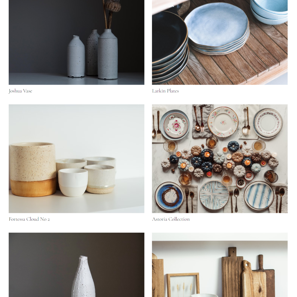
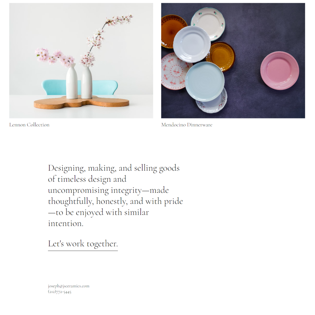
Table of Contents
Interesting Posts

How to Deploy a Website Using GitHub Pages

BSCS 6th Semester Notes

HTML Forms

Distributed Database System

Data Mining

Ghulam Ahmad is an Excellent Writer, His magical words added value in growth of our life. Highly Recommended
- Irfan Ahmad Tweet
More Posts
- 12th AKUEB Handwritten Notes
- 40+ Agency WordPress Template Kits FREE
- 50+ WordPress Template kits Free
- AI is Taking Over Web Design: Will Coders Lose Their Jobs?
- AKUEB 12th Notes
- All BS Department 1st Semester Past-papers
- Artificial Intelligence
- Artist Portfolio HTML CSS Project
- Assembly language Handwritten Notes
- BSCS 1st Semester Notes
- BSCS 2nd Semester Notes
- BSCS 3rd Semester Notes
- BSCS 4th Semester Notes
- BSCS 5th Semester Notes
- BSCS 6th Semester Notes
- BSCS 7th Semester Notes
- BSCS 8th Semester Notes
- Build a Full-Stack App with MERN Stack Pt 1
- Build a Full-Stack App with MERN Stack Pt 2
- Class 10th AKUEB Notes Biology, Physics & Chemistry
- CSS Basics
- CSS Grid vs. Flexbox: When to Use Each
- CSS Selectors
- Dark Mode in Web Development: Best Practices & Implementation
- Data Mining
- Data Structure & Algorithms Notes
- Database Management System Handwritten Notes
- Design and Analysis of Algorithms
- Distributed Database System
- DSA Handwritten Notes
- Hazel CV HTML CSS Project
- How to Build Your First Website from Scratch
- How to Deploy a Website Using GitHub Pages
- How to Use Tailwind CSS for Faster and Cleaner UI Development
- How Web3 is Transforming Web Development
- HTML CSS Landing Page
- HTML Forms
- HTML, CSS, and JS: A Beginner’s Guide to Web Development
- Introduction to HTML
- JavaScript ES6: Features Every Developer Should Know
- More HTML
- No-Code Vs. Traditional Coding: Which is the Future?
- Numerical Computing Handwritten Notes
- Random Color Generator Project
- Specificity and The Cascade
- Styling Text in CSS
- The Box Model
- The Evolution of JavaScript Frameworks: From jQuery to Next.js
- The World of CSS Colors
- Theory of Automata
- Top 10 JavaScript Libraries to Speed Up Development
- Understanding HTTP Status Codes and What They Mean
- Web Design Services Pakistan – Building Digital Brands That Inspire Confidence
- Web Design Trends for 2025: Improve User Experience
- What Is an API? A Simple Guide for Beginners
- Why Businesses Choose WordPress Website Design Pakistan for Online Success
- Wireless Communication Handwritten Notes


6 Responses